---
title: "Big Cities Health Inventory Data Visualization"
output:
flexdashboard::flex_dashboard:
orientation: columns
vertical_layout: fill
social: menu
source_code: embed
favicon: data_viz_icon.png
---
```{r setup, include=FALSE}
library(flexdashboard)
library(tidyverse)
library(rio)
library(colorblindr)
library(janitor)
library(magrittr)
library(ggrepel)
library(fontawesome)
```
# Background {data-orientation=rows data-icon="fa-info-circle"}
Sidebar {.sidebar}
-------------------------------
**Background**
Welcome to my final project for EDLD610: Communicating and Transforming Data, an amazing course taught by [Daniel Anderson](https://twitter.com/datalorax_){target="_blank"} at the University of Oregon as part of a [Data Science Specialization](https://github.com/uo-datasci-specialization){target="_blank"}. The goal of this project is to provide three data visualizations using an open-source dataset and to document how these visualizations unfolded over different iterations.
For my project, I used data from the [Big Cities Health Coalition](https://twitter.com/bigcitieshealth?lang=en){target="_blank"} (BCHC). The BCHC is a large-scale collaboration among 30 of the largest urban health departments in the United States. See the BCHC's [informational brochure](https://static1.squarespace.com/static/534b4cdde4b095a3fb0cae21/t/5c7fc5cd6e9a7f44b5abf311/1551877582500/BCHC_ABOUT+US.pdf){target="_blank"} for more details. You can download the complete dataset [here](http://bchi.bigcitieshealth.org/rails/active_storage/blobs/eyJfcmFpbHMiOnsibWVzc2FnZSI6IkJBaHBGdz09IiwiZXhwIjpudWxsLCJwdXIiOiJibG9iX2lkIn19--c6b5c30fbd8b79859797e1dc260a06064c8f3864/Current%20BCHI%20Platform%20Dataset%20(7-18)%20-%20Updated%20BCHI%20Platform%20Dataset%20-%20BCHI,%20Phase%20I%20&%20II.csv?disposition=attachment), which contains over 30,000 data points across a large variety of health indicators, e.g., behavioral health & substance abuse, chronic disease, environmental health, and life expectancy, to name just a few.
This project includes only a tiny fraction of the available BCHC data, focusing in particular on **obesity rate**, **heart disease mortality rate**, and **opioid-related mortality rate**. Click on the icons to the right for more information on these variables. You can also view the source code for each of these plots by clicking at the top right of the screen.
Row {data-height=600}
-----------------------------------------------------------------------
### Title {.no-title}
Click the image below to access the BCHC data platform:
[](http://www.bigcitieshealth.org/city-data){target="_blank"}
### Title {.no-title}
Cities included in the BCHC. Click the map below for more information on city membership.
[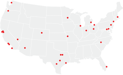](http://www.bigcitieshealth.org/our-members-big-cities-health-coalition-bchc/){target="_blank"}
Row {data-height=90}
-----------------------------------------------------------------------
### Title {.no-title}
**KEY VARIABLES OF INTEREST:**
Row {data-height=300}
-----------------------------------------------------------------------
### Title {.no-title}
*Obesity Rate*
[](http://www.bigcitieshealth.org/obesity-physical-activity){target="_blank"}
### Title {.no-title}
*Heart Disease Mortality Rate*
[](https://bchi.bigcitieshealth.org/indicators/1834/searches/22955){target="_blank"}
### Title {.no-title}
*Opioid-Related Mortality Rate*
[](http://www.bigcitieshealth.org/combatting-opioids){target="_blank"}
```{r import data, warning=FALSE}
data_raw <- import("http://bchi.bigcitieshealth.org/rails/active_storage/blobs/eyJfcmFpbHMiOnsibWVzc2FnZSI6IkJBaHBGdz09IiwiZXhwIjpudWxsLCJwdXIiOiJibG9iX2lkIn19--c6b5c30fbd8b79859797e1dc260a06064c8f3864/Current%20BCHI%20Platform%20Dataset%20(7-18)%20-%20Updated%20BCHI%20Platform%20Dataset%20-%20BCHI,%20Phase%20I%20&%20II.csv?disposition=attachment")
# wrangle data
data_filt <- data_raw %>%
clean_names() %>%
select(shortened_indicator_name, year, sex, race_ethnicity, value, place) %>%
filter(shortened_indicator_name %in% c("Adult Obesity","Heart Disease Mortality Rate","Race/Ethnicity", "Sex", "Opioid-related Overdose Mortality Rate")) %>%
mutate(value = as.numeric(value)) %>%
mutate_at(c("sex", "race_ethnicity", "place"), factor) %>%
mutate(place = plyr::mapvalues(x = .$place, from = c("Fort Worth (Tarrant County), TX", "Indianapolis (Marion County), IN", "Las Vegas (Clark County), NV", "Miami (Miami-Dade County), FL", "Oakland (Alameda County), CA", "Portland (Multnomah County), OR"), to = c("Fort Worth, TX", "Indianapolis, IN", "Las Vegas, NV", "Miami, FL", "Oakland, CA", "Portland, OR"))) %>%
na.omit()
```
# Obesity x City {data-icon="fa-weight"}
Sidebar {.sidebar}
-------------------------------
**Visualization #1**
This plot represents average obesity rates for adults (18 years and over) across all years in the dataset (2010-2018) for each city. Here, obesity rate refers to the percentage of the population that meets criteria for obesity. In general, obesity is defined in this dataset as [Body Mass Index](https://www.cdc.gov/healthyweight/assessing/bmi/index.html){target="_blank"} (BMI) of 30 or greater. This plot includes data for all races and genders. The average obesity rate for the entire U.S. is represented by the black bar. States that have higher obesity rates than the national average are colored red, and states below the national average are colored blue. From this plot, it is easy to discern that Detroit, MI had the highest average obesity rate from 2010-2018, while San Francisco, CA had the lowest average obesity rate during this time frame.
This plot is intended for a general audience. See the plots on the right for different iterations of this visualization.
```{r, warning}
# wrangle data
data_obesity <- data_filt %>%
filter(shortened_indicator_name == "Adult Obesity",
sex == "Both",
race_ethnicity == "All") %>%
spread(shortened_indicator_name, value) %>%
group_by(place) %>%
summarise(avg_obesity = mean(`Adult Obesity`, na.rm = TRUE),
sd_obesity = sd(`Adult Obesity`),
n = n()) %>%
mutate(se_obesity = sd_obesity/(sqrt(n)))
```
Column {data-width=650}
-----------------------------------------------------------------------
### Final plot
```{r}
data_obesity %>%
mutate(compare_us_tot = ifelse(
avg_obesity > .$avg_obesity[which(data_obesity$place == "U.S. Total")], "above",
ifelse(avg_obesity < .$avg_obesity[which(data_obesity$place == "U.S. Total")], "below", "avg"))) %>%
ggplot(aes(fct_reorder(place, avg_obesity), avg_obesity)) +
geom_col(aes(fill = compare_us_tot), alpha = 0.8) +
coord_flip() +
scale_y_continuous(labels = scales::percent_format(scale = 1)) +
scale_fill_manual(values = c("#BA4A00", "black", "#ABCFF7")) +
labs(title = "Average Obesity Rates per City", subtitle = "Data from 2010-2018", y = "Percent of Adults Who Are Obese", x = NULL, caption = "Vertical line represents the U.S. average.\n States above/below the U.S. average are colored red/blue, respectively.") +
theme_minimal() +
geom_hline(yintercept = data_obesity$avg_obesity[which(data_obesity$place == "U.S. Total")], linetype = 2) +
theme(legend.position = "none",
panel.grid.major.y = element_blank())
```
Column {.tabset data-width=350}
-----------------------------------------------------------------------
### Version 1
```{r}
data_obesity %>%
ggplot(aes(place, avg_obesity, avg_obesity)) +
geom_col() +
coord_flip()
```
> Here is the first pass at the plot. Re-ordering the bars in descending order would make it much easier to visually identify which states have the highest/lowest obesity rates. The graph also needs a title and a better X axis label. We can also remove the `place` label since it's not really necessary.
### Version 2
```{r}
data_obesity %>%
ggplot(aes(fct_reorder(place, avg_obesity), avg_obesity)) +
geom_col() +
coord_flip() +
scale_y_continuous(labels = scales::percent_format(scale = 1)) +
labs(title = "Percent of Adults Who Are Obese", y = "Percent", x = NULL) +
theme_minimal()
```
> Now that the bars are re-ordered, we can easily identify Detroit as the city with the higehst average obesity rates and San Francisco as the city with the lowest. Another way to improve the graph would be to make the bar for the U.S. average stand out and color the bars for individual cities according to whether they are above or below the U.S. average.
### Version 3
```{r}
data_obesity %>%
mutate(compare_us_tot = ifelse(
avg_obesity > .$avg_obesity[which(data_obesity$place == "U.S. Total")], "above",
ifelse(avg_obesity < .$avg_obesity[which(data_obesity$place == "U.S. Total")], "below", "avg"))) %>%
ggplot(aes(fct_reorder(place, avg_obesity), avg_obesity)) +
geom_segment(aes(color = compare_us_tot, x = fct_reorder(place, avg_obesity), xend = place, y=0, yend = avg_obesity), size = 1, alpha = 0.7) +
geom_point(aes(color = compare_us_tot), size = 3, alpha = 0.7) +
coord_flip() +
scale_y_continuous(labels = scales::percent_format(scale = 1)) +
scale_color_manual(values = c("#BA4A00", "black", "#ABCFF7")) +
labs(title = "Percent of Adults Who Are Obese", y = "Percent", x = NULL) +
theme_minimal() +
geom_hline(yintercept = data_obesity$avg_obesity[which(data_obesity$place == "U.S. Total")], linetype = 2) +
theme(legend.position = "none")
```
> Now we have a simple color scheme that quickly tells us whether a given city is above or below the U.S. average in terms of its obesity rates. Adding a vertical line at the U.S. average also makes it easier to visually compare *how much* each city is above/below the national average. Here I'm also trying out a lollipop plot just for fun. Ultimately, I think a bar plot looks cleaner and makes the colors easier to discern. We can also make the title and axis label more informative and add a caption to explain the color coding. Lastly, we can remove the horizonal grid lines, as they don't add any utility to the visualization and cause unnecessary visual "clutter."
# Heart Disease x Obesity {data-icon="fa-heartbeat"}
Sidebar {.sidebar}
-------------------------------
**Visualization #2**
This plot shows the relationship between average adult obesity rates and average heart disease mortality rates at the city level, collapsed across all years available in the dataset (2010-2018). Again, obesity rate refers to the percentage of adults with BMI ≥30. Heart disease mortality rate refers to the number of individuals per 100,000 who have died from heart disease. This variable is age-adjusted, likely to account for the fact that risk for heart complications such as heart attack, stroke or coronary heart disease [increases with age](https://www.nia.nih.gov/health/heart-health-and-aging){target="_blank"}. This plot includes data for all races and genders. From this graph, we can see that cities with higher obesity rates tend to also have higher heart disease mortality rates. This is not at all surprising, given the evidence that [obesity increases the risk for cardiovascular disease](https://www.obesityaction.org/community/article-library/cardiovascular-disease-obesity-and-the-heart/){target="_blank"}.
This plot is intended for more of a scientific audience, as it communicates a statistical relationship between two variables, but it should still be understandable to a general audience. See the plots on the right for different iterations of this visualization.
```{r}
# wrangle data
obesity_hdmr <- data_filt %>%
filter(shortened_indicator_name %in% c("Adult Obesity", "Heart Disease Mortality Rate"),
sex == "Both",
race_ethnicity == "All",
place != "U.S. Total") %>%
mutate(i = row_number()) %>%
spread(shortened_indicator_name, value) %>%
group_by(place) %>%
summarize(avg_obesity = mean(`Adult Obesity`, na.rm = TRUE),
avg_hdmr = mean(`Heart Disease Mortality Rate`, na.rm = TRUE))
```
Column {data-width=650}
-----------------------------------------------------------------------
### Final plot
```{r}
## 3 most obese cities
top_3_obese <- obesity_hdmr %>%
top_n(3, avg_obesity)
## 3 least obese cities
bottom_3_obese <- obesity_hdmr %>%
top_n(-3, avg_obesity)
obesity_hdmr %>%
ggplot(aes(avg_obesity, avg_hdmr)) +
geom_point(size = 5, alpha = 0.5, color = "gray70") +
geom_point(data = top_3_obese, size = 5, color = "#BA4A00", alpha = 0.7) +
geom_point(data = bottom_3_obese, size = 5, color = "#ABCFF7", alpha= 0.7) +
geom_smooth(method = "lm", alpha = 0.2, color = "gray60") +
geom_text_repel(data = top_3_obese, aes(label = place), min.segment.length = 0) +
geom_text_repel(data = bottom_3_obese, aes(label = place), min.segment.length = 0) +
theme_minimal() +
scale_x_continuous(labels = scales::percent_format(scale = 1)) +
labs(x = "Percent of Adults Who Are Obese", y = "Heart Disease Mortality Rate", title = "Relationship between Obesity and Heart Disease", subtitle = "Data from 2010-2018", caption = "3 most/least obese cities are labeled and colored red/blue, respectively.\nHeart disease mortality rates age adjusted; per 100,000 people.")
```
Column {.tabset data-width=350}
-----------------------------------------------------------------------
### Version 1
```{r}
obesity_hdmr %>%
ggplot(aes(avg_obesity, avg_hdmr)) +
geom_point() +
geom_smooth(method = "lm")
```
> Here is a rough n' dirty plot of the relationship between these two variables. The relationship between obesity and heart disease is already clear, but there are several things we could do improve the visual appeal and intuitiveness of the graph. For starters, we can add a `theme_minimal` to get rid of the gray background and add labels to the points so we know which cities are which.
### Version 2
```{r}
obesity_hdmr %>%
ggplot(aes(avg_obesity, avg_hdmr)) +
geom_point() +
geom_smooth(method = "lm") +
geom_text_repel(aes(label = place)) +
theme_minimal()
```
> Here I used `ggrepel` to label the points since the labels would otherwise overlap quite a bit and likely be difficult to read. However, this makes the graph look really cluttered. So, instead of labeling all of the cities, let's instead just label the top and bottom 3 cities in terms of obesity rates.
### Version 3
```{r}
obesity_hdmr %>%
ggplot(aes(avg_obesity, avg_hdmr)) +
geom_point() +
geom_smooth(method = "lm") +
geom_text_repel(data = top_3_obese, aes(label = place), min.segment.length = 0) +
geom_text_repel(data = bottom_3_obese, aes(label = place), min.segment.length = 0) +
theme_minimal()
```
> Now only the 3 most/least obese cities are labeled. At this point, there are still several things we could do to improve the plot. First, we need to add a descriptive title and caption and use better axis labels. We can also increase the size of the points and reduce the transparency of the regression line and confidence interval so it doesn't obscure the labels as much. To be consistent with our last graph, we can also color the 3 most obese cities red and the 3 least obese cities blue and make the rest of the points light gray so the colored points stick out more.
# Opioid Deaths x Gender {data-icon="fa-tablets"}
Sidebar {.sidebar}
-------------------------------
**Visualization #3**
This plot communicates gender differences in opioid-related overdose mortality rates in Colombus, OH from 2010 to 2016. As with heart disease mortality rate, opioid-related overdose mortality rate is age-adjusted and refers to the number of individuals per 100,000 who have died from overdosing on opioids. I chose to focus on data only from Colombus, as this was the city in this dataset with the highest average opioid-related overdose mortality rate during this time period (see Source Code for how this was determined). From this plot, we can see that there was a general increase in opioid-related deaths in Colombus beginning from around 2014-2016 and that this increase was more pronounced for males compared to females. This gender difference seems to be consistent with patterns for both the [the state of Ohio in general](https://www.kff.org/other/state-indicator/opioid-overdose-deaths-by-gender/?dataView=2&activeTab=graph¤tTimeframe=1&startTimeframe=7&selectedDistributions=male--female&selectedRows=%7B%22states%22:%7B%22ohio%22:%7B%7D%7D%7D&sortModel=%7B%22colId%22:%22Location%22,%22sort%22:%22asc%22%7D){target="_blank"} and [the U.S. as a whole](https://www.kff.org/other/state-indicator/opioid-overdose-deaths-by-gender/?dataView=2&activeTab=graph¤tTimeframe=1&startTimeframe=7&selectedDistributions=male--female&selectedRows=%7B%22wrapups%22:%7B%22united-states%22:%7B%7D%7D%7D&sortModel=%7B%22colId%22:%22Location%22,%22sort%22:%22asc%22%7D){target="_blank} during this time period.
This plot is inteded for a general audience, as the recent [opioid epidemic](https://www.hhs.gov/opioids/about-the-epidemic/index.html){target="_blank"} in the U.S. is of broad concern and interest. See the plots on the right for different iterations of this visualization.
```{r}
# wrangle data
data_opioid <- data_raw %>%
clean_names() %>%
select(shortened_indicator_name, year, sex, race_ethnicity, value, place) %>%
filter(shortened_indicator_name %in% c("Opioid-Related Overdose Mortality Rate")) %>%
mutate(value = as.numeric(value)) %>%
mutate_at(c("sex", "race_ethnicity", "place"), factor) %>%
na.omit()
# identify city with highest opioid-related overdose mortality rate from 2010 to 2016
top_opioid = data_opioid %>%
filter(sex == "Both",
race_ethnicity == "All",
place != "U.S. Total",
year %in% 2010:2016) %>%
unique() %>%
spread(shortened_indicator_name, value) %>%
group_by(place) %>%
summarize(mean_opioid = mean(`Opioid-Related Overdose Mortality Rate`, na.rm = TRUE)) %>%
top_n(1) %>%
select(place)
```
Column {data-width=650}
-----------------------------------------------------------------------
### Final plot
```{r}
data_opioid %>%
filter(sex != "Both",
race_ethnicity == "All",
place == top_opioid$place,
year %in% 2010:2016) %>%
spread(shortened_indicator_name, value) %>%
ggplot(aes(year, `Opioid-Related Overdose Mortality Rate`, color= sex)) +
geom_line(size= 2) +
geom_point(size = 4) +
labs(x = NULL, y = "Opioid-Related Overdose Mortality Rate", title = "Opioid-use Related Mortality Rates Over Time", subtitle = "Data from Colombus, OH", caption = "Opioid-use related mortality rates age-adjusted; per 100,000 people.") +
theme_minimal() +
scale_color_OkabeIto() +
theme(legend.position = "none") +
geom_label(data = data_opioid %>%
filter(sex != "Both",
race_ethnicity == "All",
place == top_opioid$place,
year == 2016) %>%
spread(shortened_indicator_name, value),
aes(y =`Opioid-Related Overdose Mortality Rate`, label = sex),
nudge_x = -0.7,
size = 5) +
scale_x_continuous(breaks = scales::pretty_breaks(n=7)) +
theme(panel.grid.minor.x = element_blank())
```
Column {.tabset data-width=350}
-----------------------------------------------------------------------
### Version 1
```{r}
data_opioid %>%
filter(sex != "Both",
race_ethnicity == "All",
place == top_opioid$place,
year %in% 2010:2016) %>%
spread(shortened_indicator_name, value) %>%
ggplot(aes(year, `Opioid-Related Overdose Mortality Rate`, color= sex)) +
geom_line()
```
> Here is the raw first-pass plot. Removing the gray background with `theme_minimal` would help to see the line colors better. We can also remove the `year` label on the x axis, as it is not necessary. It would also look better to make the lines a bit thicker and add a `geom_point` so we can more easily discern discrete data points for each year. The graph also needs a title.
### Version 2
```{r}
data_opioid %>%
filter(sex != "Both",
race_ethnicity == "All",
place == top_opioid$place,
year %in% 2010:2016) %>%
spread(shortened_indicator_name, value) %>%
ggplot(aes(year, `Opioid-Related Overdose Mortality Rate`, color= sex)) +
geom_line(size= 2) +
geom_point(size = 4) +
labs(x = NULL, y = "Opioid-Related Overdose Mortality Rate", title = "Opioid-use Related Mortality Rates Over Time", subtitle = "Colombus, OH") +
theme_minimal()
```
> It's looking a bit better. However, since we have only two groups that we're plotting (males and females), it would reduce the cognitive load of the graph to get rid of the legend and simply label the lines directly.
### Version 3
```{r}
data_opioid %>%
filter(sex != "Both",
race_ethnicity == "All",
place == top_opioid$place,
year %in% 2010:2016) %>%
spread(shortened_indicator_name, value) %>%
ggplot(aes(year, `Opioid-Related Overdose Mortality Rate`, color= sex)) +
geom_line(size= 2) +
geom_point(size = 4) +
labs(x = NULL, y = "Opioid-Related Overdose Mortality Rate", title = "Opioid-use Related Mortality Rates Over Time", subtitle = "Colombus, OH") +
theme_minimal() +
theme(legend.position = "none") +
geom_label(data = data_opioid %>%
filter(sex != "Both",
race_ethnicity == "All",
place == top_opioid$place,
year == 2016) %>%
spread(shortened_indicator_name, value),
aes(y =`Opioid-Related Overdose Mortality Rate`, label = sex),
nudge_x = -0.7,
size = 5)
```
> Now, we need to still add a descriptive caption to help us better interpret the units of the `Opioid-use Related Mortality Rate` variable. To make the graph a little more colorblind friendly, we can use `colorblindr::scale_color_OkabeIto` to ensure that the two lines are the easy to distinguish. Finally, since this data only spans 7 years, it would be better to label every single year on the x axis instead of skipping every other year, which adds more detailed information without making the graph look too cluttered.


